Designing a kiosk people can use while holding a drink
Self-service ordering in a bar is not a website. Lighting, noise, one-handed use, queue pressure and a first-time user every single time - what that changes about the interface.
- Design
- UX
- Guest experience
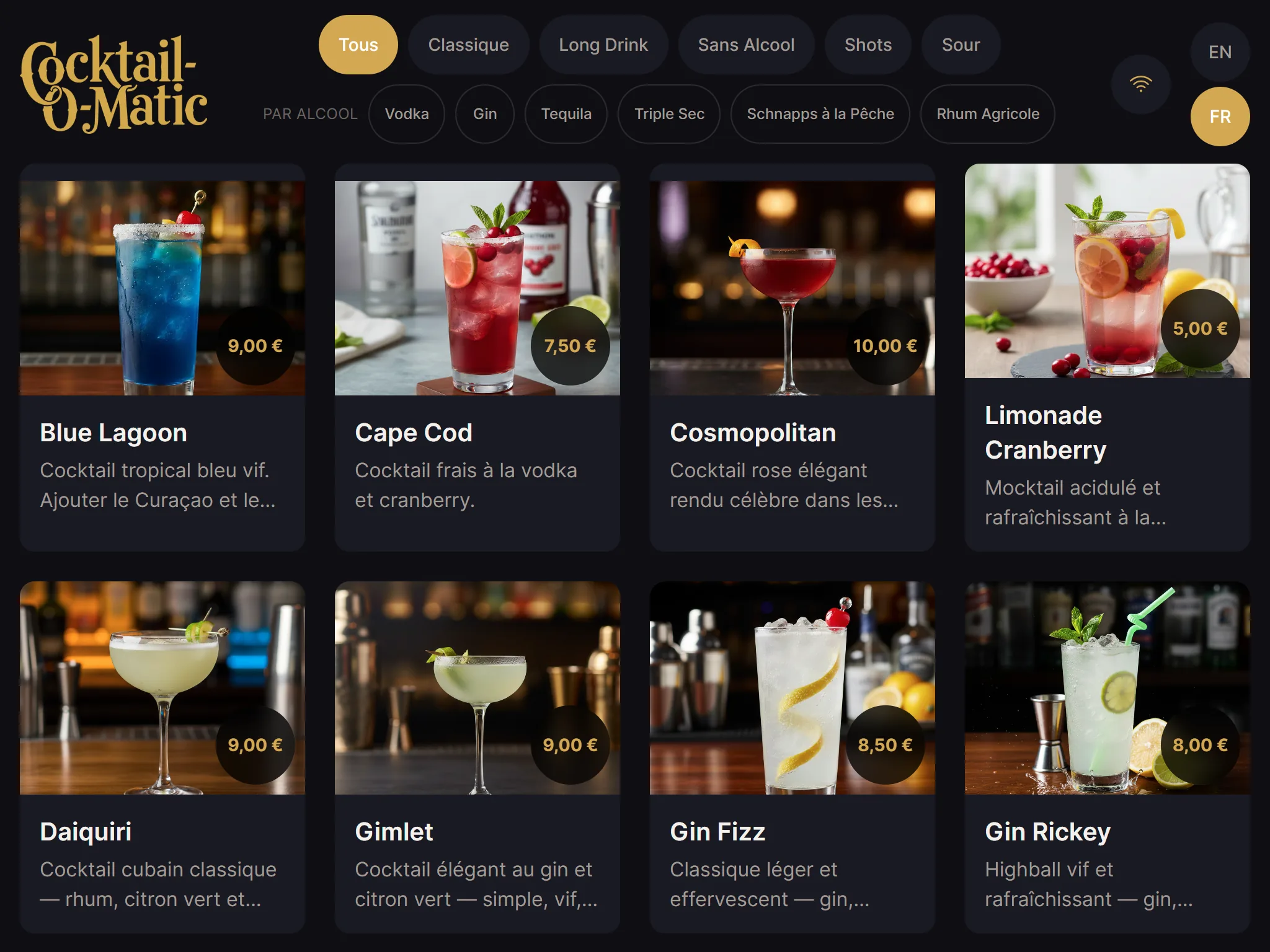
A bar kiosk has a user profile that almost nothing else shares: every single user is a first-time user, most of them are standing, many are holding something, the room is dark and loud, and there is a queue behind them.
Design for that and the interface looks nothing like a normal ordering app. Here is what actually changes.
Nobody will learn your interface
There is no second session. No onboarding, no tutorial, no “you’ll get used to it”. Whatever a guest understands in the first two seconds is the entire interface as far as they are concerned.
The practical consequence: the first screen must be the menu. Not a welcome screen, not a language picker, not a category tree. A grid of drinks with pictures, tappable immediately. Every screen you put in front of the menu is a screen where someone gives up and joins the human queue instead.
One thumb, one hand
Assume the guest has a drink, a phone or a friend’s coat in the other hand. That means:
- Targets big enough to hit without aiming. Bar lighting plus alcohol plus a moving crowd is not a precision environment.
- No drag, no long-press, no swipe-to-reveal. Tap is the only gesture you can rely on.
- Nothing important at the top of a large screen. On a wall-mounted 15-inch display, the top third is a stretch for a lot of people. Put the actions at thumb height.
- No hover states, obviously - but also no design that depends on them to be understandable.
Dark room, bright screen
Bar rooms are dark, and a screen at full brightness in a dark room is a floodlight in the face. A dark interface with restrained contrast is more comfortable, reads better from a distance and looks better in the room.
But dark does not mean low contrast. Text still needs to be legible to someone with tired eyes at arm’s length, which in practice means larger type and stronger text contrast than a desktop design would use. The two goals - not blinding people, and remaining readable - are both satisfied by a dark background with genuinely bright text, not by grey on grey.
Show what is actually available
The fastest way to lose a guest’s trust is to let them choose something the machine cannot make.
If a bottle is empty, the drink comes off the menu or is visibly marked unavailable before they tap it. Discovering the problem at the confirmation step is much worse than never seeing the option: they have already invested effort, and they are now annoyed in front of a queue.
This is where ingredient groups earn their place. If you have declared your two vodka brands as interchangeable, a recipe calling for vodka stays on the menu whichever bottle happens to be connected - where a naive system would have hidden it. The recipes feature covers how the groups are defined.
Respect the queue
The person tapping is not your only user. The four people behind them are also your users, and their experience is “how long is this taking”.
- Show pour progress. A visible gauge turns a wait into a wait with a known end. A blank screen for 45 seconds feels like a failure.
- Let the next person start. Every second the interface spends locked while a drink pours is a second the queue is not moving. Allowing the next choice during the pour is the cheapest throughput gain available to a kiosk.
- Fail fast and loudly. If something goes wrong, say so immediately rather than timing out silently. The worst kiosk state is the one where nobody can tell whether it is working.
Language without a language screen
A bilingual venue does not need to ask. Show a compact language toggle in a corner and default to the venue’s primary language. Guests who need the other one will find a two-letter switch; guests who do not will never be interrupted.
Language support is on every Cocktail-O-Matic tier including the free one, precisely because gating it would push venues towards a worse guest experience for commercial reasons.
Test it in the actual room
This is the part people skip. An interface reviewed on a laptop at a desk is an interface tested in the wrong conditions. Before an installation goes live:
- Look at it in the room’s real lighting, at the height it will be mounted
- Look at it from two metres away, which is where the queue stands
- Try it with the actual sound level of a busy night
- Hand it to someone who has never seen it and say nothing at all
That last one is brutal and it is the only test that matters. Where they hesitate is your interface’s real problem, not the one you assumed.
You can run this test today: the live demo serves the real guest kiosk in a browser, so you can put it on a tablet, take it into your venue and watch someone use it before you commit to anything.